Peter Saville. Pioneer.
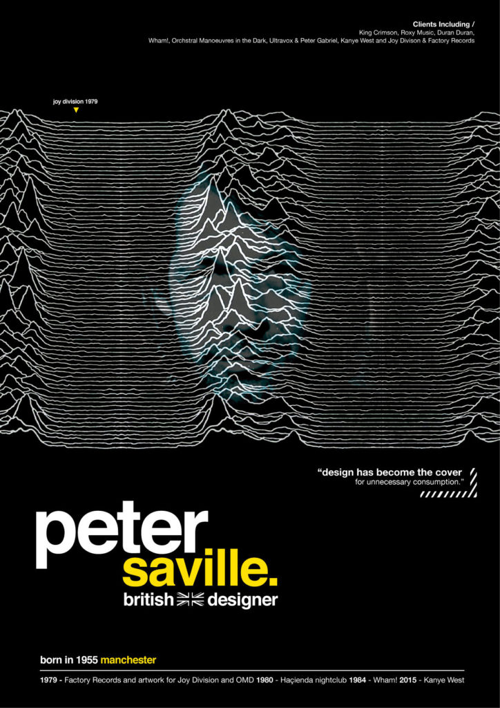
Perhaps one of the most renowned art directors and graphic designers in the world. Peter Saville became known for his incredibly successful and superbly unique album covers, where most were known from the band Joy Division. We’re forever inspired by the designers who have come before us and felt it was the right time to create our inspired piece of art, not for Joy Division, but for the man who created the synonymous cover.
The Brief
Inspire others.
Relive Savilles most famous work.
Integrate a timeline of his works.
How we Answered.
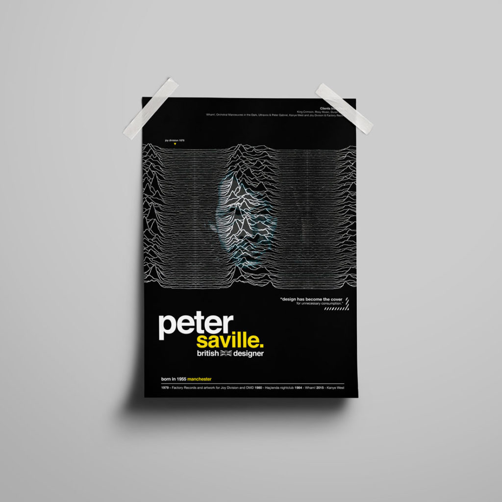
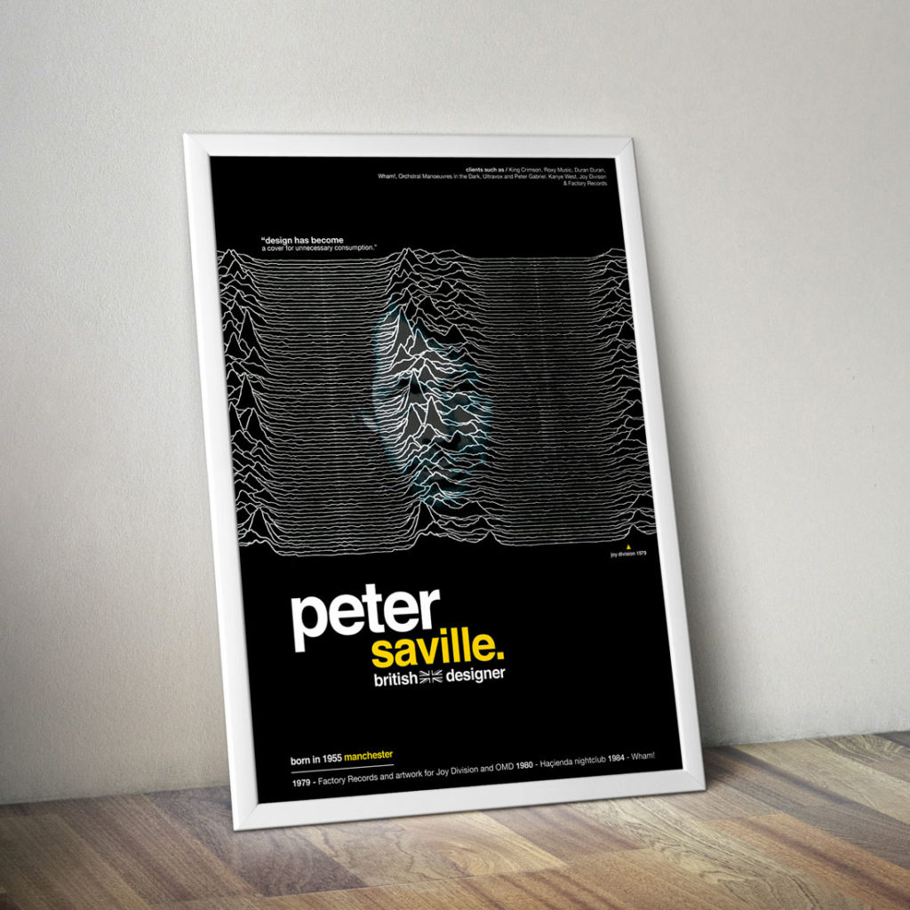
Our work on this brief stemmed from many outcomes that Saville has produced. Of course, we used his most famous as our starting ground. See more of our work and stay up to date with us by following our Instagram page.
We went through many variations before rearching our desired outcome, and as many good designers will tell you, less is more. Yellows to blacks, black to yellows, and finally yellow back to white. Only one thing stayed the same during our design process, and that was the font. Helvetica was the only font we were certain would work. Past experiences with the font meant we were fairly certain it’d be a success…and it was (if we do say so ourselves).

Our Results
A homage to one of the greatest designers of our generation, Peter Saville.


